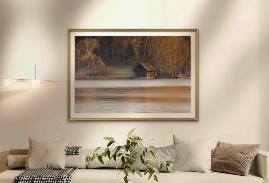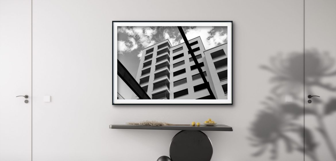

Black and white architecture photography has always felt like a conversation with order. I notice it most when I enter a minimal room: the air seems larger, the light has space to move, and the smallest contrast between white wall and dark frame becomes a quiet event. In that space, a monochrome architectural print does not perform. It steadies the room.
I return to these subjects because they simplify what matters. Line, rhythm, light and shadow become the language. The building is still there, but what speaks is the way it holds itself together: the cadence of windows, the slight tension of a diagonal, the deep pause that a shadow can create at the edge of a form. With time, these elements begin to feel less like documentation and more like a presence you can live with.
Human Traces grew from this impulse. I think of buildings not as monuments, but as evidence that we try to make sense of space. Balconies, screens, numbers on facades—small signs of habitation and order—are the marks we leave behind. In a minimal interior, these photographs can serve as a gentle anchor: a steady rhythm that lets the room remain open while holding a quiet center.
When a line slows the eye, a room remembers how to breathe.
1. A Room That Learns From Line And Light
When a room is stripped back to essentials, any object that enters must justify its place. I like that discipline. It asks a simple question: does this add presence without noise? Black and white architectural photographs often answer yes, because they are built from the same language as the room—light, shadow, surface, proportion.
Over the years I have noticed how quickly color can dominate a minimal space. A monochrome print steps aside, letting the architecture of the room continue to lead. What remains is a calm tension between wall and image, where lines extend beyond the frame and shadows echo in corners.
I do not look for spectacle. I look for a structure that invites the eye to slow down. In that slowness, the image stops being a subject and becomes part of the room’s atmosphere.
2. Structure And Rhythm On A Quiet Wall
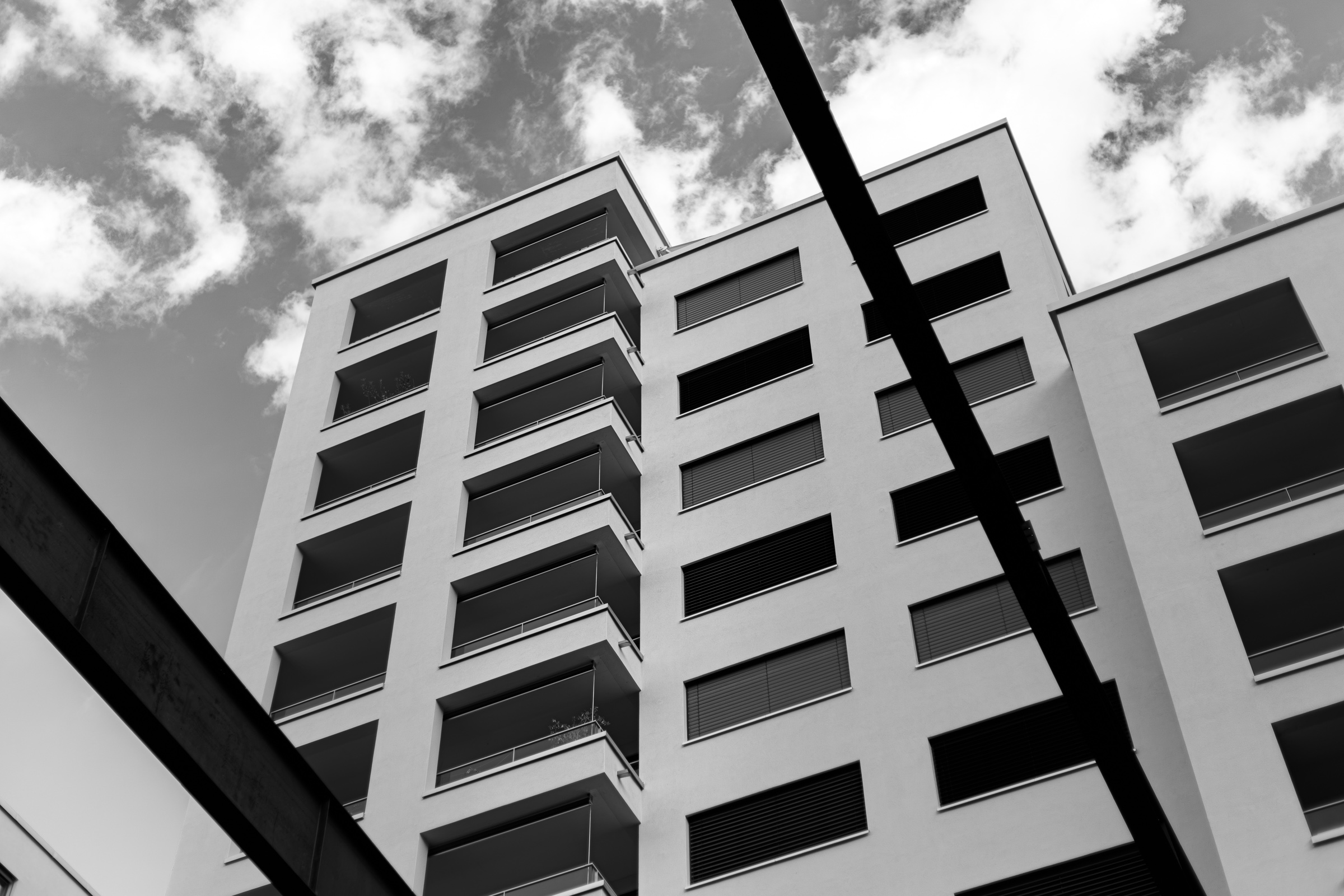
I often begin with the upward view—a facade seen from below, where balconies and windows push diagonally into a bright sky. The perspective creates movement, but in black and white it settles into clarity. White planes carry light; dark openings hold it back. Between them, rhythm forms.
In a minimal interior, this kind of rhythm becomes architectural support for the room itself. It establishes a pace for the eye: left to right, up and across, pause at a shadow, continue along a rail. The wall stops being empty surface and becomes field—something that holds direction without forcing attention.
What I appreciate most is how the image converses with negative space. The clean wall offers quiet. The photograph adds a measured beat. Together, they create a room that feels composed rather than decorated.
3. Human Traces, Not Monuments
When I photograph buildings for Human Traces, I am not interested in prestige. I look for the sober gesture: a row of windows that admits daylight at the same hour, a staircase that lifts bodies one floor higher, a screen that softens heat and glare. These are human needs made visible, and they leave marks—literal traces—on surfaces.
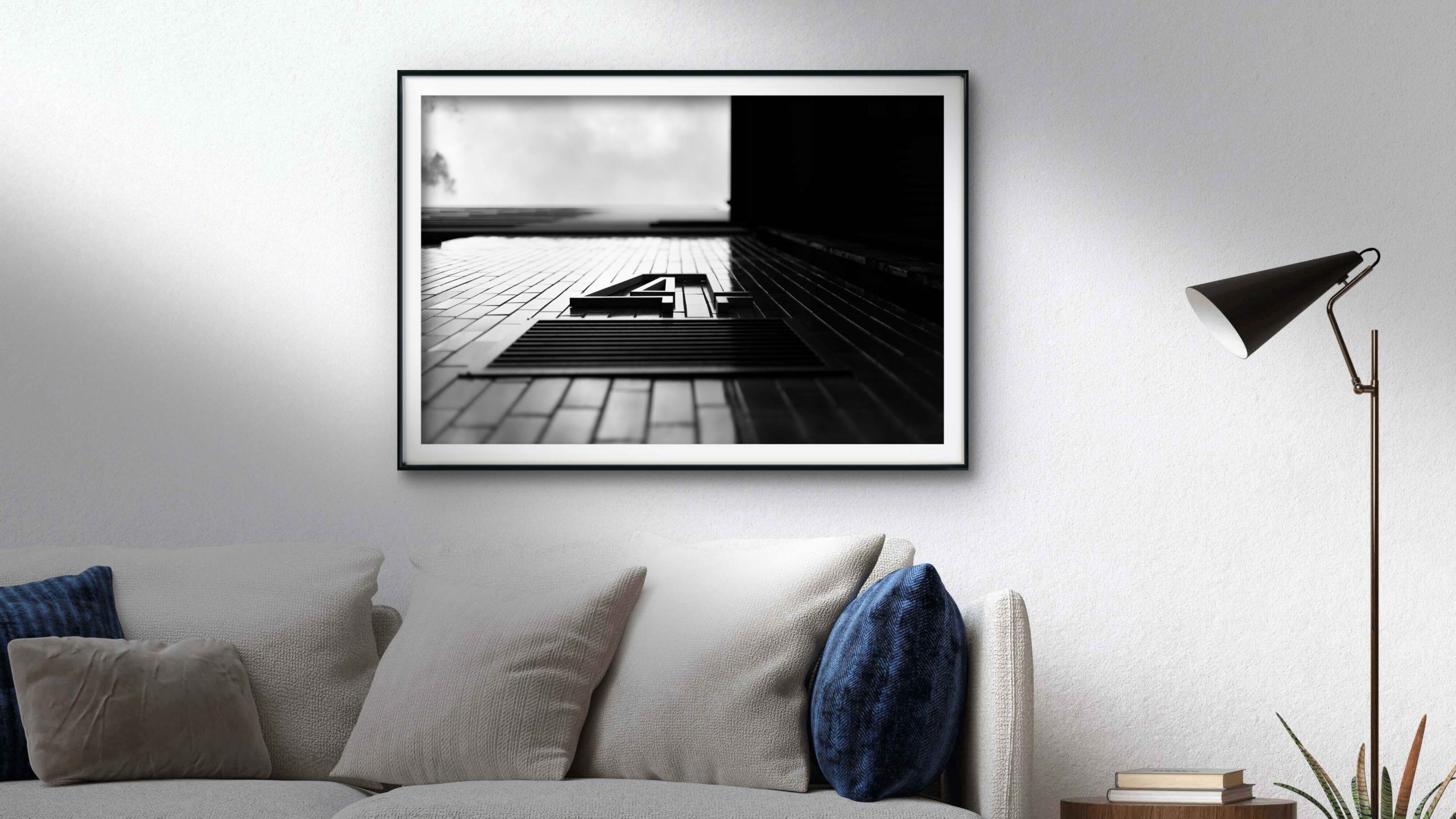
I return to this idea because it replaces spectacle with attention. A balcony is a balcony, but in the evening light it also becomes a thin line of shadow tracing daily life. A number on a facade turns a grid into a place you might find yourself. In black and white, these markers become clear without becoming loud.
For interiors, that attitude matters. The print on the wall does not claim authority. It offers evidence: we build, we name, we repeat, we organize. The room listens, and perhaps we listen too.
4. Materials In Conversation
Minimal homes often rely on a modest palette: concrete or limewash, pale wood, linen, glass, perhaps a quiet metal. Black and white photographs respect those materials. They bring a structural counterpoint without competing for color. A dark frame can hold its own next to steel; a soft white mat can echo plaster; a deep black shadow can enrich the grain of oak.
This is not about matching. It is about creating a calm conversation between textures. When light lands across a print at midday, the matte paper receives it differently than the wall, and that difference gives depth. In the evening, the darker passages seem to gather the room’s remaining light, holding a gentle focus where everything else softens.
I have learned to place prints in ways that let materials speak. Allow air around the frame. Leave a margin where wall meets image. Let the photograph stand close to a tactile surface—linen, stone, timber—so the eye can move between pattern and plain.
5. In The Living Room, A Gentle Anchor
A living room asks for a center that does not insist on itself. I often think of a print above a sofa as a way to name that center. The image sets a tone for the room’s pace: conversations, quiet evenings, a book left open beside a lamp. When the subject holds a small human marker—a number, a threshold, a handrail—the room gains an immediate sense of use and memory.
Black and white helps this stay understated. The photograph supports daily life instead of taking it over. If the eye keeps returning, it is because there is rhythm to revisit: repeating windows, the clean lift of a line, a soft gradation of light along a facade.
In these domestic settings, I look for images that feel both intimate and ordered. They do not need to be large to be present. They need to be clear, patient and quietly welcoming.
6. Scale, Whitespace And The Pace Of The Eye
Choosing the right size is less about rules and more about breathing room. A print that is too small in a spacious minimal interior can feel like a thought left unfinished. Too large, and the image may overpower the quiet. I prefer a margin that lets the eye arrive, rest and leave without friction.
A few gentle considerations help:
– Let the frame width echo another line in the room: a shelf, a door jamb, a sofa back.
– Keep 8–15 cm of clear wall on all sides of the frame when possible, so the image can breathe.
– Hang a touch lower than gallery height in a living area, closer to the way you sit and inhabit the space.
– Choose matte papers and non-reflective glazing in bright rooms to keep light soft.
These are not rules to enforce; they are ways to sustain calm. When I follow them, the photograph feels less like an object and more like part of the room’s architecture.
7. Vertical Calm And Repetition
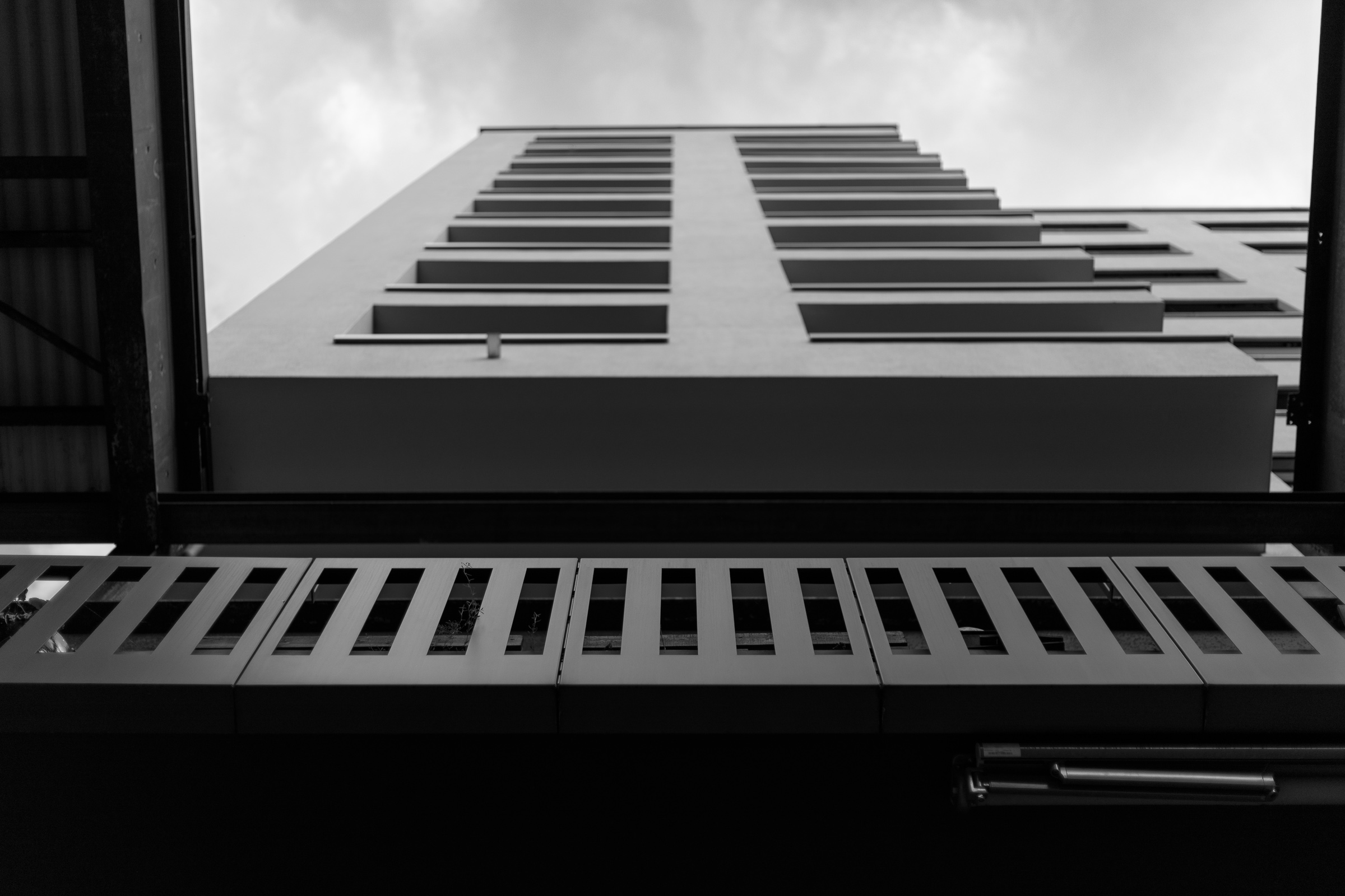
Some buildings invite a different kind of attention: pure verticality, a measured ascent of windows and structure. In black and white, the repetition becomes almost musical. Each window is a note, each mullion a beat. A darker foreground or frame can deepen the sense of entry, the way a doorway frames a view.
I return to such subjects when a room needs a stronger spine. The photograph introduces order that remains quiet. You can read the image from bottom to top, feeling how the cadence steadies your gaze. Nothing shouts; it holds.
Placed in a corridor or a study, vertical repetition can set the day’s tempo. It is a small discipline that supports larger calm.
8. Between Document And Memory
Architectural photographs are often read as straightforward records. I do not mind that reading, but I try to keep a space open for memory. After a few weeks on a wall, an image is no longer only what it depicts. It becomes what it holds: moments of morning light, the echo of a conversation, the pause you took before leaving the house.
In that sense, the subject of a building is a beginning. What remains is the feeling of structure, a rhythm that lives in the periphery of attention. I like when an image is strong enough to be noticed and gentle enough to be forgotten in the best way—present without demanding.
This is where black and white helps again. By releasing color, the photograph steps closer to abstraction, and memory finds more room to move.
9. Presence Without Noise
There are times when architecture nearly dissolves into pattern. A perforated screen, a field of light and shadow, a skin of small openings—what remains is an arrangement of tones and intervals. I am drawn to these subjects because they carry the idea of building without insisting on the building itself.
On a muted wall, such an image can become a quiet fulcrum. It adds texture to a room that prefers restraint, and it keeps attention soft. You do not need to read the structure; you can simply live with its rhythm.
When a room is already calm, this kind of abstraction brings depth rather than activity. The pattern breathes; the space around it breathes with it.

See the Artwork on Your Own Wall
Choosing the right print size can be difficult when viewing artwork online. With the Wall Preview Tool ,you can upload a photo of your room and visualize the artwork directly on your wall. This makes it easier to compare sizes, evaluate placement, and select the print that best fits your space.
FAQ
|
Why does black and white architecture photography work well in minimal interiors? Because it speaks the same language as minimal rooms: line, light, shadow and proportion. Without color, structure becomes clear and quiet. The photograph adds presence and rhythm to a wall while respecting materials like wood, concrete, linen or stone, so the space feels composed rather than decorated. |
|
How large should a black and white architectural print be for a living room? Think in terms of balance and breathing room. Above a sofa, the image often feels right when it spans about two-thirds to three-quarters of the furniture width. Leave a comfortable margin of wall around the frame and hang slightly lower than gallery height, closer to seated eye level, so the print becomes part of daily life. |
|
Will monochrome architectural images make a room feel cold? Not if the image carries rhythm, light and a measured use of shadow. Pairing black and white with tactile materials—oak, linen, stone—adds warmth through contrast. Matte paper and a soft white mat can also introduce a quiet, tactile quality that keeps the work from feeling austere. |
|
Where should I place a vertical, repetitive facade image in my home? Corridors, studies and entryways suit vertical repetition well because they already guide movement. The image can set a calm pace as you pass. In a living room, a vertical print can act as a visual spine when paired with lower, horizontal furniture, adding order without crowding the room. |
|
What kind of frame works best with black and white architectural prints? Simple frames—black, white or natural wood—allow the image to lead. A white mat often gives the photograph space to breathe, especially on darker walls. In bright rooms, non-reflective glazing preserves the soft tonal range and keeps highlights gentle, so the print remains part of the atmosphere. |
Final Thought
I often leave a place with one clear impression: the way a line met the sky, the small gravity of a shadow under a balcony, the soft insistence of a grid repeating itself floor after floor. These are not grand scenes, yet they continue speaking once they are on the wall. In a minimal interior, they lend a center that does not close the room. Instead, they open it toward attention.
Black and white architecture photography, at its best, is a conversation with order. It simplifies the world to the parts we can inhabit with ease: rhythm, light, space. When those parts return home as a print, they do not simply show a building. They help the room remember how to hold stillness, and how to keep breathing.
If these reflections resonate, the Human Traces collection continues this quiet dialogue through images shaped by line, rhythm and light. Spend a little time with them; notice how your eye slows.