Fine art landscape prints often enter a home as an idea long before they arrive as paper and frame. I have learned to start by listening to what a room asks for. Some spaces want energy, others seek rest. The photograph becomes a way to invite that atmosphere in, not an ornament that shouts for attention. The hero image at the top — storm light breaking over alpine peaks — reminds me that intensity has a place, but it must be chosen with care in relation to daily life.
When I choose a print for my own spaces, I look past subject and style and search for a sensation: the speed of the image, the quality of silence inside it, the way my eye slows or moves. A photograph that fits a room does more than look right; it adjusts the rhythm of the space.
The process is calm. I sit in the room at different hours. I notice how daylight moves across the wall, how shadows form in late afternoon, where conversation naturally gathers. Only then do I explore images. The choice becomes simpler because the room has already begun the conversation.
What follows is not a set of rules. It is a way of approaching images so that fine art landscape prints can belong in your home with the same ease as a well-worn chair or a window you return to every morning.
Begin with atmosphere, not decoration. The right photograph will quietly teach the room how to breathe.
1. A Room Begins With Atmosphere
Before speaking about frames, sizes or color, I pause and ask what the room is for. A living room that holds long conversations needs an image that can sit beside words without interrupting them. A hallway that greets arrivals may ask for a clearer focal point that offers direction. A bedroom asks to exhale.
I have found that the most meaningful choices come when I let function lead feeling. If a room is where you read in the late evening, choose an image whose light is gentle enough to remain in your peripheral vision without insisting on itself. If a room is where family gathers with lively energy, a bolder photograph can become a stable anchor in the background, holding the scene together rather than competing with it.
This is why I begin with atmosphere before decoration. When the room’s purpose is clear, the rest becomes a practice of alignment. The photograph should not fix the space, but help it return to what it already is. Over time, that alignment feels natural, as if the image had always been there, waiting to be noticed.
2. The Quiet Strength Of Simple Subjects
Some of the images I return to most often are simple: a single tree at dawn, a horizon that holds its breath, a line of light where night gives way to day. Simplicity slows the eye. It leaves space for memory and for the small rituals that shape home life.
A solitary form is not emptiness. It is a choice. When the subject is clear, everything around it gains importance: the air, the temperature of color, the shape of negative space. In a home, that clarity is valuable. It lets the room and the photograph learn each other’s rhythm. I have watched a minimal print soften a space that felt restless, not by instructing calm but by demonstrating it.
When I live with a simple image, I notice how it changes throughout the day. Dawn softens pink to pearl. Evening pulls the darker tones outward. The photograph begins to act like a window to a slower climate. For rooms that need a steadier pulse, this kind of subject often becomes a quiet anchor that endures long after trends move on.

3. Matching Image To Room Purpose
Every room speaks with its own voice. The choice of artwork is a way of listening to that voice and answering with care. I think in pairs: purpose and presence. If I understand why a space exists, I can choose how a photograph should behave inside it.
Some pairings I have found helpful are simple:
– Living room: an image with balance and a readable focal point that encourages conversation without pulling it away.
– Bedroom: a calmer palette and soft transitions, so the last glance at night and first glance in the morning feel unhurried.
– Workspace: an image with a clear horizon or directional flow that helps focus without tightening the mind.
– Entryway: a photograph that offers welcome through light and structure rather than spectacle.
None of these are rules. They are starting points. The most important question remains: what rhythm do you want to protect in this room? When that answer is honest, the photograph follows. It is surprising how often the right image becomes obvious once I stop searching for agreement with furniture and start listening for continuity with daily life.
4. Color Palette As Light, Not Formula
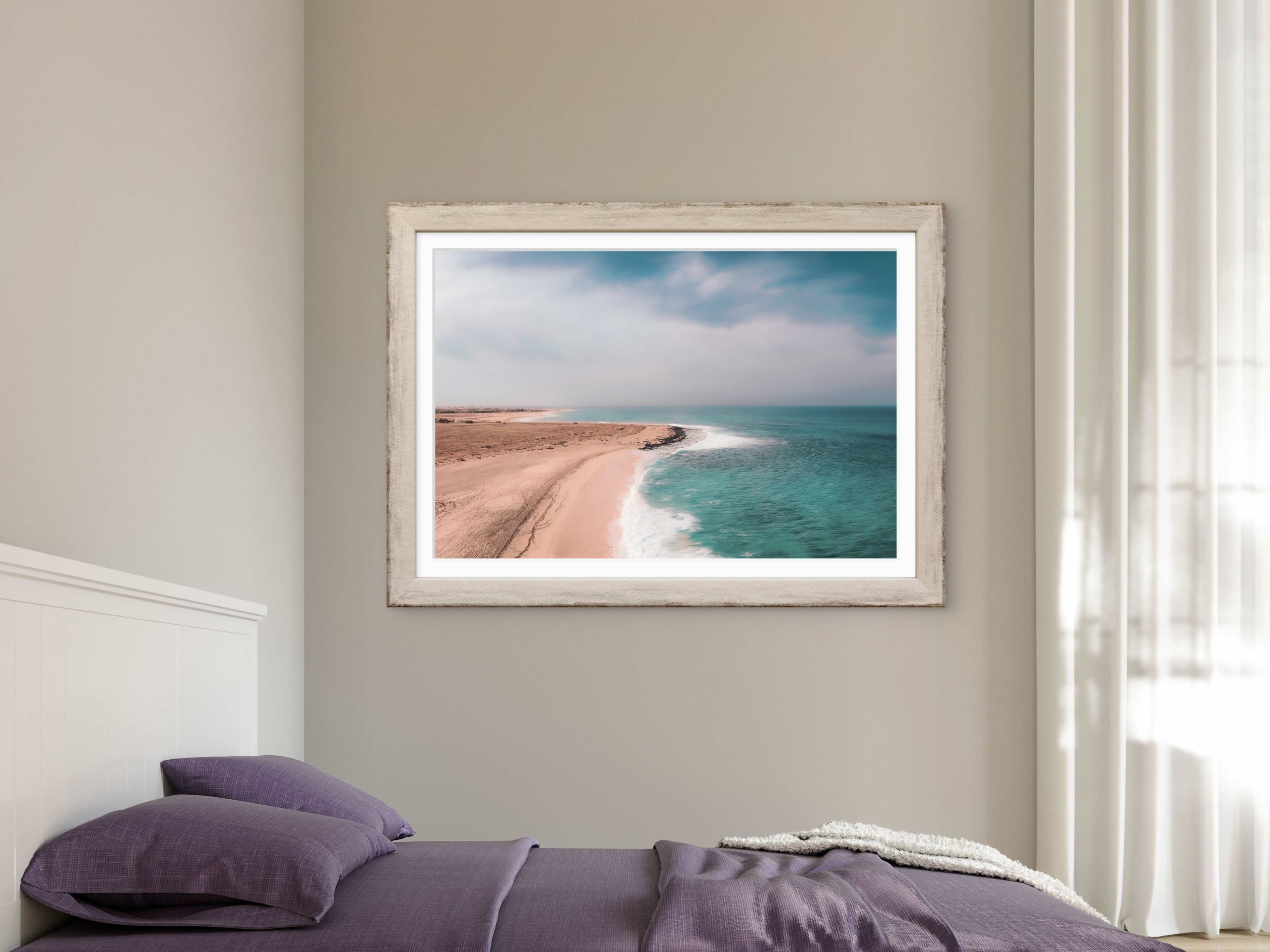
I rarely try to match a photograph to a paint swatch. Rooms breathe. Light shifts through seasons and hours, and with it, colors drift. Instead of chasing exact matches, I look for a palette that behaves like the room’s light. A minimal coastline under pastel tones, for example, doesn’t echo a single color in a cushion; it brings the feeling of open air into the space.
I think of color as temperature and weight. Pastel blues and soft turquoise feel open and clean; pale sands soften edges; a trace of warm coral can hold the memory of late sun. When an image’s palette has the same temperature as the room’s natural daylight, they tend to agree without effort.
If there is one practical note I return to, it is this: prefer subtle harmonies over perfect matches. Subtlety lasts. A photograph with a restrained palette continues to feel generous as the room evolves. Over years, I have seen gentle colors carry more resilience than exact matches that tire quickly once the novelty fades.
5. Intimacy And Detail Without Noise
Not every landscape needs distance. Sometimes intimacy is closer: the curve of a weathered boat reflected in still water, grain raised by years of light and salt. I am drawn to these details because they carry time within them. They bring a quieter density into a room without crowding it.
Close images are well suited to smaller spaces and to corners reserved for pause. A reading chair, a narrow hallway, a place where you tie your shoes in the morning — these are intimate territories. A close, textural photograph gives them a center. The key is to choose detail that remains gentle. Texture should invite the hand without asking for explanation.
I ask myself: will this image still feel nourishing when I see it ten times a day? If the answer is yes, it usually means the photograph holds more than surface. It carries patience. That quality endures better than spectacle.
6. Scale, Proportion And Breathing Room In Fine Art Landscape Prints
Choosing size is less about filling a wall and more about establishing proportion. I measure with my eyes first. How far will the viewer typically stand? What else shares the wall — a window, a shelving line, a doorway? The print should converse with these elements, not compete with them. In a bedroom, for instance, the image above a headboard benefits from a width that relates to the bed’s horizontal line, leaving calm margins so the wall can still breathe.
Two small prints can sometimes hold a space better than one large one, especially where the room invites a gentle rhythm. In other settings, a single statement piece offers clarity by reducing visual chatter. What matters most is the margin around the image. White space is not unused; it is where the room rests.
When I need a quick guide, I use simple proportions:
– For a focal wall, choose a print width of roughly two-thirds to three-quarters of the furniture below it.
– In a reading corner, a medium print at eye level encourages intimacy without overpowering the chair.
– In narrow passages, a vertical piece with generous borders helps the body move comfortably through the space.
Stand back, sit down, move through the room. If the print still feels balanced from all those positions, scale is right. The photograph will have room to breathe and, in turn, it will help the room do the same.
7. Negative Space And The Comfort Of Quiet
Some images are defined as much by what is absent as by what appears. A blue hour lake with mountains and a broad sweep of open water teaches the eye to rest. Negative space is not lack; it is quiet potential. In a home, that quiet can be generous, especially where days end and begin.
I pay attention to how my attention behaves with these images. Do I arrive, settle, and then continue to notice new relationships between shape and distance? That is a good sign. Calm prints are never empty; they are attentive. They leave just enough for the mind to complete, which is why they remain interesting over time.
If a room lives with many objects — books, textures, family life — an image with generous negative space can act like a clearing. It invites a pause without announcing itself. Over months and years, that steady pause becomes part of the room’s character.
8. Letting The Decision Be Slow
I have learned not to rush the choice. A photograph is a presence, not an accessory. I print small proofs when I can, pin them to the wall and live with them for a week. Morning light has one opinion, evening another. If the image keeps offering a quiet yes, I move forward. If I notice indifference, I keep looking.
This slowness is not caution for its own sake; it is respect for daily life. A print that will stay for years deserves time to arrive. Trends can be tempting. But a home is a long conversation. Choose images that speak clearly to your memory, not to a passing season. The ones that last are rarely the loudest; they are the most honest.
If these reflections resonate, I often suggest exploring the Between Worlds collection. It is a body of work shaped by transitions — between weather and calm, distance and closeness, land and water — and it holds a range of moods that can live comfortably in many kinds of rooms without losing their quiet center.

See the Artwork on Your Own Wall
Choosing the right print size can be difficult when viewing artwork online. With the Wall Preview Tool ,you can upload a photo of your room and visualize the artwork directly on your wall. This makes it easier to compare sizes, evaluate placement, and select the print that best fits your space.
FAQ
|
How do I choose fine art landscape prints that fit my home without matching colors exactly? Look for a shared temperature rather than a perfect match. If the room’s daylight feels cool and open, choose images with gentle blues and light neutrals. If the space is warmer, consider soft earth tones. Subtle harmonies age better than exact matches. |
|
What size print should I choose for above a bed or sofa? A simple guide is to select a width around two-thirds to three-quarters of the furniture below. Leave comfortable margins so the wall can breathe, and hang the center near eye level when seated. If the piece still feels balanced from different positions, the size is right. |
|
Are dramatic images suitable for calm rooms like bedrooms? They can be, but with care. Consider whether the image encourages rest at night and a gentle start in the morning. Often, calmer palettes and soft transitions serve bedrooms better, while dramatic images work well in entryways or living spaces that welcome a touch of energy. |
|
Should I frame fine art landscape prints the same way throughout my home? Consistency helps, but it does not have to be rigid. Choose a framing language that suits your architecture and materials, then let small variations respond to each room. Simple, well-made frames with generous borders allow the image and the space to breathe together. |
|
How can I tell if a print will still feel meaningful years from now? Live with a small proof if possible. Notice how often you return to the image and whether it keeps offering something new without asking for attention. Photographs grounded in clear subjects, balanced composition and honest color tend to outlast trends. |
Final Thought
Homes teach us how to see. When a photograph enters with integrity, it doesn’t decorate a wall; it becomes part of the room’s conversation with light, memory and time. Choose slowly. Let the room speak first. Then select the image that listens best.
If these ideas feel close to how you live with images, spend some time with the Between Worlds collection. It gathers moments shaped by stillness and transition, and it may help you continue the quiet search for the right presence in your rooms.